Some car logos are so instantly recognizable, they barely need a name attached. But those emblems didn’t just appear out of thin air. Behind each badge is a story—sometimes about family, sometimes about national pride, and sometimes just about standing out in a crowded market. These logos were designed to represent everything the brand stood for, often decades before the world knew what they’d become.
This article looks at 10 of the most iconic car logos and the stories that gave them shape. From mythological symbols to stylized initials, you might be surprised by what’s hidden in plain sight.
Ferrari: The Prancing Horse with War Roots
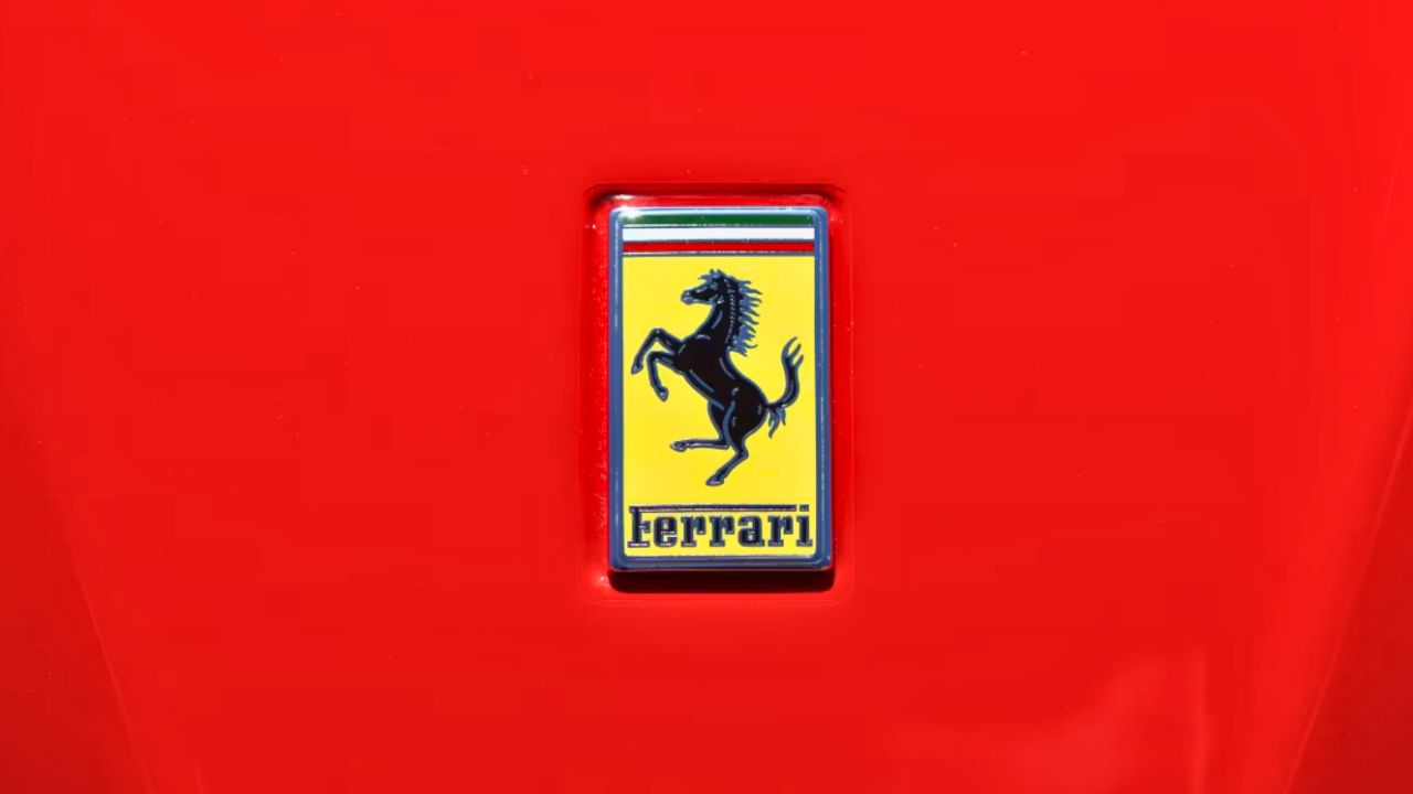
Ferrari’s iconic prancing horse didn’t originate with Enzo Ferrari. The emblem was originally painted on the plane of World War I Italian flying ace Francesco Baracca. After his death, Baracca’s family suggested Enzo adopt the horse as a symbol of good luck. He did just that in 1929, adding a canary yellow background to represent his hometown of Modena. Today, it’s one of the most recognized emblems in the world.
The logo’s elegance belies its origins in war. Over the decades, it has come to stand for speed, prestige, and Italian craftsmanship. Even stripped of words, it’s unmistakably Ferrari.
Mercedes-Benz: A Star Born from Engineering Ambition
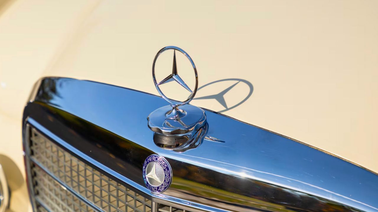
The three-pointed star of Mercedes-Benz represents land, sea, and air—symbolizing Daimler’s early vision to power all forms of transportation. The design dates back to 1909 when Paul and Adolf Daimler used a star their father once marked on a postcard to indicate future success.
Paired with a laurel wreath and later simplified, the star became an icon of engineering precision and German design. More than just a badge, it reflects Mercedes-Benz’s role in shaping the modern automobile.
BMW: A Spin on Propeller Mythology
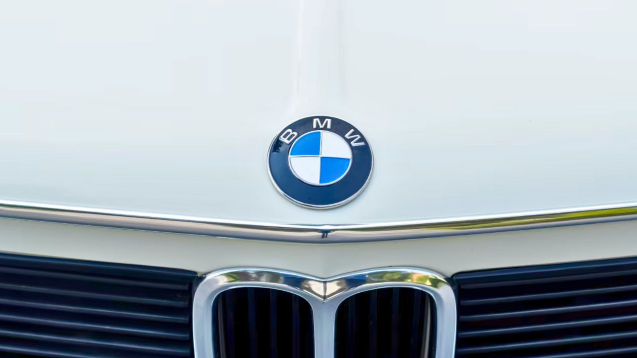
BMW’s logo has often been mistaken for a spinning airplane propeller, a myth reinforced by early ads. In reality, it stems from the colors of the Bavarian flag—white and blue—arranged in a circular format that originated from the Rapp Motorenwerke emblem, BMW’s precursor.
Still, the aviation connection isn’t entirely wrong: BMW did build aircraft engines before it built cars. But the logo’s look comes more from heritage than horsepower.
Ford: A Script That Stuck
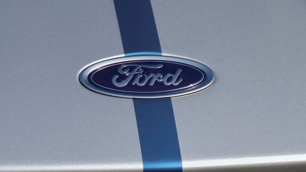
The Ford logo is one of the oldest, most unchanged marks in the industry. The blue oval and flowing script were first introduced in 1907, just four years after the company was founded. Childe Harold Wills, one of Henry Ford’s earliest employees, designed the lettering.
That familiar typeface has endured, reflecting the brand’s staying power and no-nonsense identity. It’s not flashy or futuristic—just dependable, like the cars it represents.
Chevrolet: A Bowtie with Murky Origins
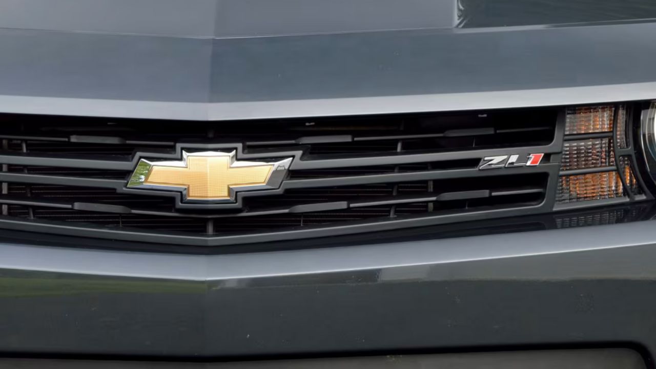
The Chevrolet bowtie has a mysterious backstory. Some say it was inspired by wallpaper in a French hotel; others believe it was adapted from a coal company logo. William Durant, Chevrolet’s co-founder, claimed different stories at different times.
Regardless of origin, the bowtie debuted in 1913 and has remained central to Chevy’s identity. It’s a simple mark that now signals everything from muscle cars to family trucks.
Porsche: A Crest Built from City and State
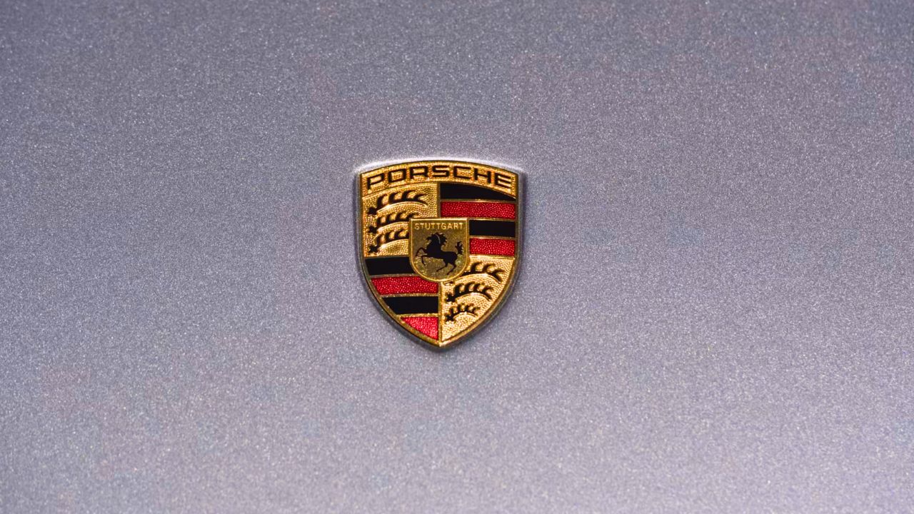
Porsche’s badge combines elements of the Stuttgart city seal and the coat of arms of the state of Württemberg. The prancing horse comes from Stuttgart, the company’s hometown, while the antlers and red-and-black stripes hail from the region’s heraldry.
Designed in 1952, the logo merges Porsche’s roots with its performance focus. It’s ornate, but it wears its heritage proudly—a perfect fit for a brand that values tradition and engineering.
Lamborghini: Bullish and Personal
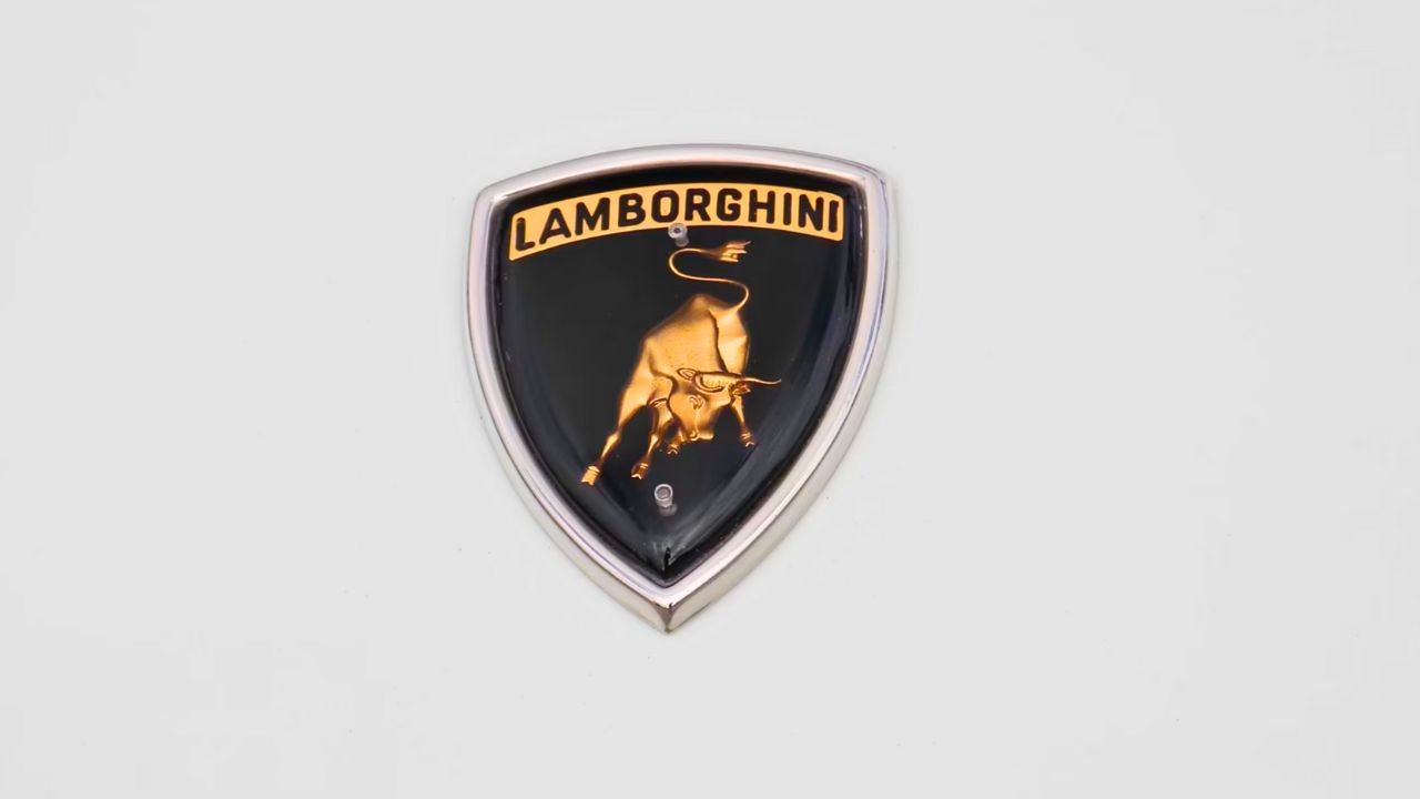
Ferruccio Lamborghini chose the raging bull as a personal touch. He was born under the Taurus zodiac sign and had a passion for bullfighting, so the animal made sense for his upstart supercar brand. It also stood as a jab at Ferrari—a company he famously clashed with.
Debuting in 1963, the Lamborghini logo conveys brute power and confidence. Every detail, from the gold-on-black color scheme to the aggressive posture, supports that image.
Toyota: Three Ellipses, One Global Vision
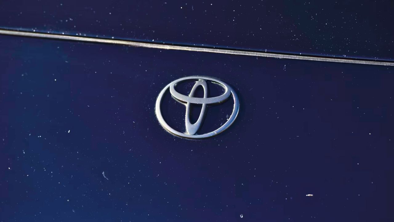
Toyota’s current logo, introduced in 1989, uses three overlapping ellipses. One represents the customer, another the product, and the third the unification of both in trust. The overall shape also resembles a steering wheel.
Minimalist but deeply symbolic, the logo reflects Toyota’s evolution into a global brand. It doesn’t scream; it communicates harmony and precision, fitting for a company built on consistency.
Volkswagen: Simplicity by Design
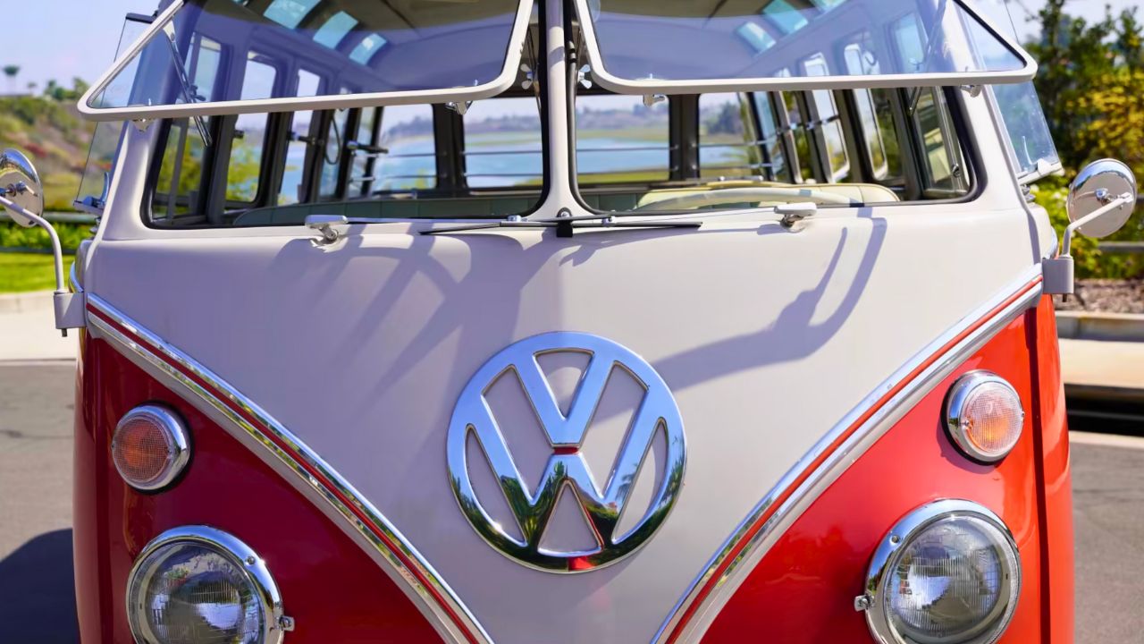
The VW logo, designed in 1937, combines the “V” for “Volks” (people) and the “W” for “Wagen” (car) in a clean, circular frame. Originally more industrial-looking, the design has been gradually refined over time.
Despite its complicated historical ties, the logo remains one of the clearest brand marks around. It’s unmistakable on a Beetle or a Golf, and it’s lasted through radical changes in both style and society.
Dodge: Evolving to Match Attitude
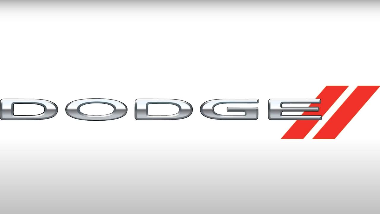
Dodge has worn several badges over the years. The ram’s head appeared in the early 1990s, borrowed from the brand’s trucks, while earlier versions featured a star, shield, and even wings. In 2010, the brand split Ram trucks off, and Dodge reworked its identity.
The current Dodge logo is simply the brand name with two red racing slashes. It’s angular and aggressive, fitting the company’s muscle car-heavy lineup. More slogan than symbol, it’s aimed at those who like their cars loud and fast.
Like what you read? Here’s more by us:
*Created with AI assistance and editor review.


Leave a Reply