There’s a lot to love about 60s muscle cars—big power, raw sound, and styling that still turns heads. But for every perfectly spec’d GTO or Charger, there were a few factory paint jobs that left people wondering, “Why that color?” Not every muscle car rolled off the line looking like a menace. Some showed up looking more like a department store appliance.
In this list, we’re digging into the factory colors that just didn’t work. These weren’t custom flops—they were showroom options that clashed hard with the muscle attitude underneath.
1. 1969 Dodge Charger – Butterscotch Yellow
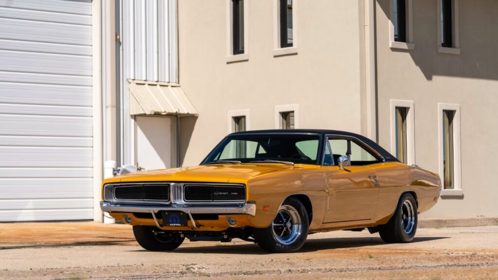
The Charger had muscle and presence, but Butterscotch Yellow didn’t do it any favors. On a car known for aggressive lines and brutal 440 and HEMI engines, this flat, dull yellow looked more kitchen appliance than street brawler.
Available on both R/T and base models, the color completely muted the car’s bold character. It clashed with popular black vinyl tops and made Magnum 500 wheels look like an afterthought. A high-performance muscle car with 375 hp shouldn’t come off like a taxi cab.
2. 1967 Chevrolet Camaro – Mountain Green
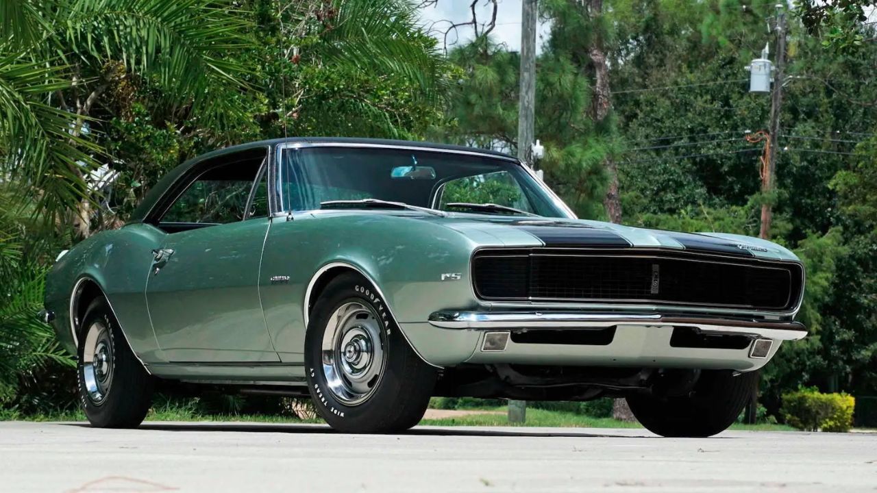
Mountain Green wasn’t hideous in theory, but on a first-year Camaro, it killed the vibe. The deep metallic green lacked contrast and made the car disappear in a crowd. Not ideal for a 275-hp SS 350.
Pair it with parchment interiors, and the whole setup looked tired before it even hit the road. Buyers wanted muscle that popped. Instead, this one faded into the background, even when it had the power to stand out.
3. 1966 Ford Mustang – Sahara Beige
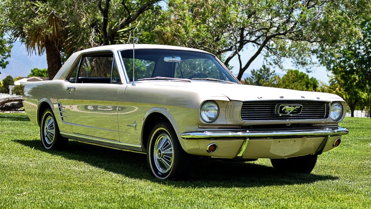
Sahara Beige drained every ounce of energy from the Mustang’s sleek silhouette. On a car that helped launch a movement, this flat tan made it look like a fleet rental.
Even GT models with the Hi-Po 289 and styled steel wheels couldn’t save it. Ford offered brighter hues like Rangoon Red or Tahoe Turquoise that made the car feel alive—Sahara Beige felt like a compromise someone else picked for you.
4. 1969 Plymouth Road Runner – Ivy Green Metallic
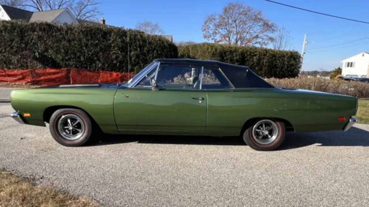
The Road Runner was loud and proud, but Ivy Green made it look like it was trying to sneak through a golf course parking lot. It didn’t match the 383’s 335 hp punch or the signature “beep-beep” attitude.
Plymouth offered much louder options—Limelight and Vitamin C, for starters—but Ivy Green was the least inspiring. It aged the car instantly, and even the optional Air Grabber hood couldn’t wake it up visually.
5. 1968 Pontiac GTO – Verdoro Green
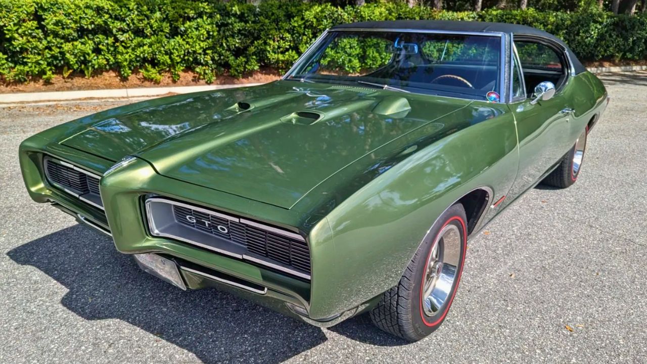
Verdoro Green was a Pontiac favorite, but that deep olive hue dulled the GTO’s edge. Paired with Rally II wheels and a black vinyl roof, it had more of a country club vibe than muscle car aggression.
The GTO deserved better. With a 400-cubic-inch V8 and optional Ram Air, it could scream, but Verdoro made it whisper. Pontiac pushed this color hard, but many buyers quickly opted for resprays or swapped to brighter factory choices.
6. 1967 AMC Marlin – Frost White
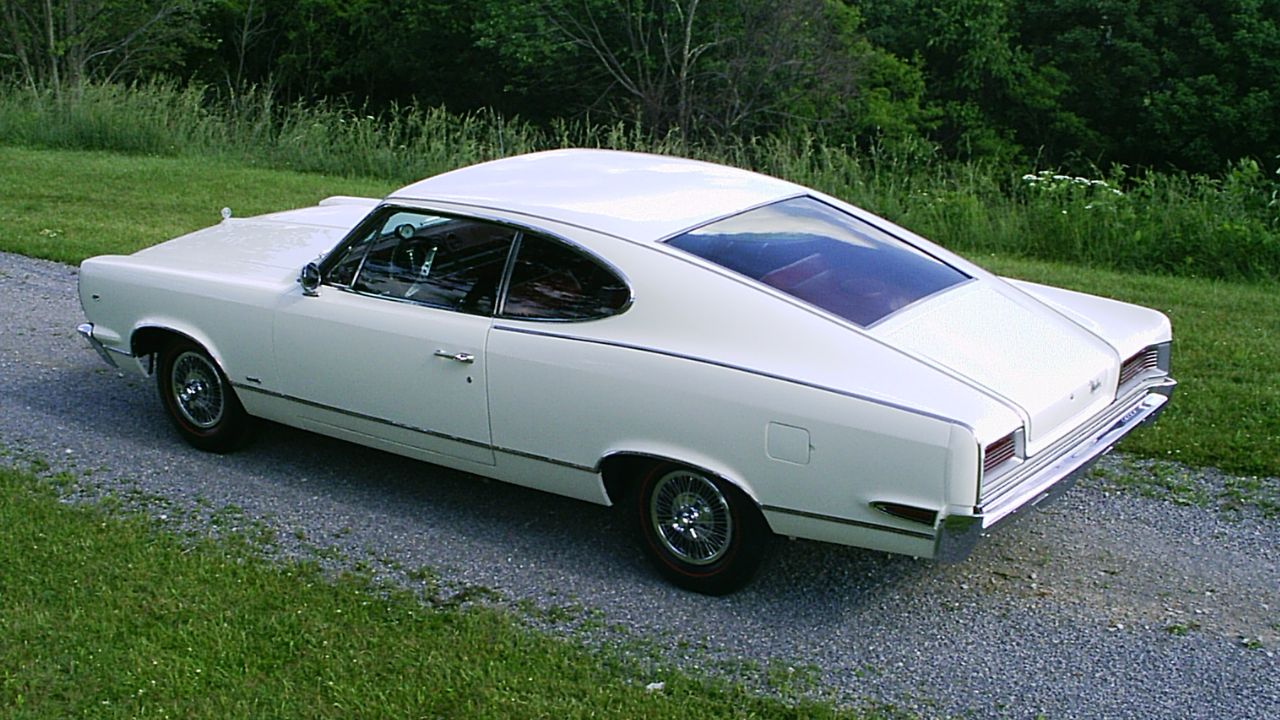
Technically more a muscle-adjacent fastback, the Marlin in Frost White was pure washing machine. The color flattened out every curve and left nothing for the eye to hold onto.
AMC offered more expressive hues, but Frost White was common—and it undersold a car trying to be different. Even with the 343 Typhoon V8 and upgraded interiors, it felt unfinished. The design needed help, and the paint didn’t give it any.
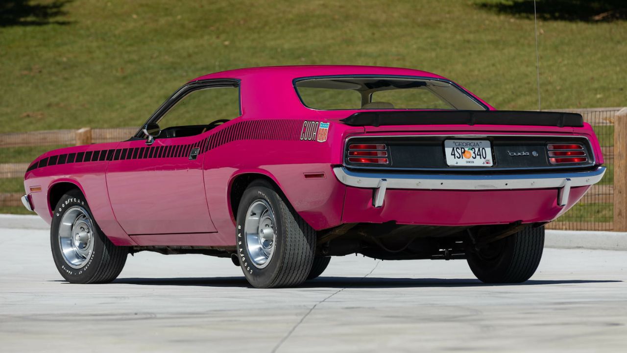
7. 1970 Plymouth Barracuda – Moulin Rouge
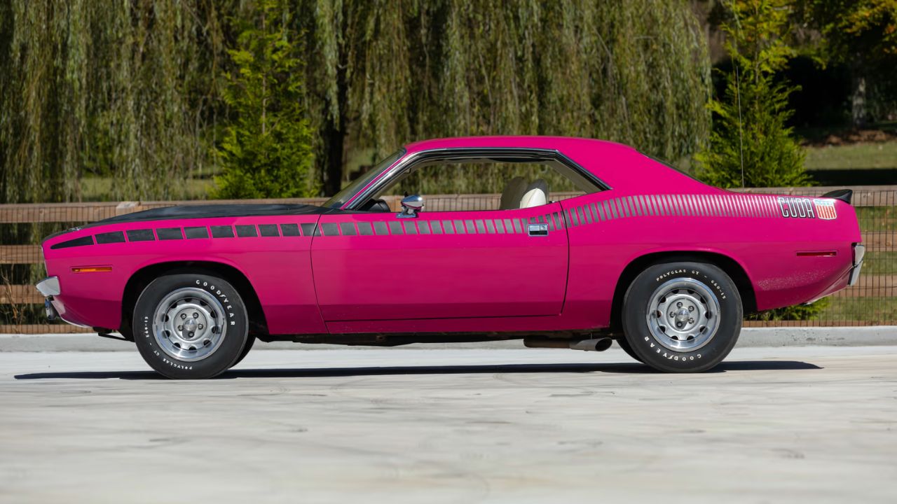
Moulin Rouge wasn’t subtle, and that was exactly the point. Slapped onto the newly redesigned 1970 Barracuda, this hot pink paint (code FM3) was part of Chrysler’s High Impact lineup. Officially called Moulin Rouge for Plymouth and Panther Pink for Dodge, it was one of the most polarizing factory colors of the era. You either loved it or swore someone lost a bet at the paint booth.
While it’s considered rare and collectible now, back then, it didn’t help the ’Cuda’s tough-guy image. Dealers reportedly had trouble moving them off the lot. In an era of burnt orange, lime green, and deep metallic blues, the pink muscle car pushed things a little too far — and not everyone was ready for it.
8. 1965 Buick Gran Sport – Seafoam Green
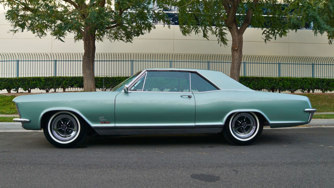
Seafoam Green didn’t belong on a car with a 401 Nailhead V8 making 445 lb-ft of torque. The Gran Sport had serious torque and weight, but this borderline pastel clashed with its demeanor.
Even with deluxe interiors and full gauges, it looked soft. Buick wasn’t chasing teenagers, but this color made the Gran Sport seem like it skipped the muscle movement altogether. It looked like something your aunt might pick, not your drag racing buddy.
9. 1969 Oldsmobile 442 – Cameo White with Gold Stripes
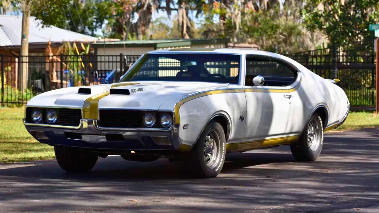
This one’s controversial. Cameo White with gold accents was technically the Hurst/Olds scheme—but not everyone loved the contrast. The stripes often looked muddy or faded quickly, and the overall look didn’t match the 455’s brutality.
While mechanically excellent, the color scheme felt overdesigned and a bit forced. The car performed, no question, but visually, it never quite felt cohesive. Olds made better paint calls elsewhere in the lineup.
10. 1966 Dodge Coronet – Light Blue Metallic
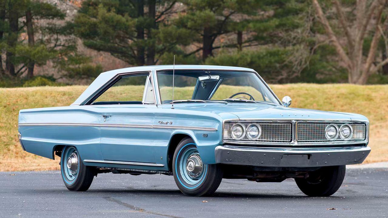
Light Blue Metallic had a soft, almost pastel tone that made the already conservative Coronet feel sleepy. Even the Coronet 500, with its 426 HEMI, couldn’t overcome the visual letdown.
Dodge was throwing serious power into these cars, but the color choice felt like a holdover from the early ’60s. It looked better on sedans than hardtops or coupes, and that’s saying something. For a car that could run low 13s, it just didn’t dress the part.
Like Fast Lane Only’s content? Be sure to follow us.
Here’s more from us:
*Created with AI assistance and editor review.
Leave a Reply