Mid‑century drivers did not just sit behind a steering wheel. They faced a wall of gauges, toggle switches, chrome bezels and warning lights that looked closer to a Boeing flight deck than to a modern family car. That crowded look was not simply a styling fad; it grew out of a mix of aviation envy, new electronics and a belief that more information would make drivers feel in control.
As digital screens flatten the modern cockpit into a pair of rectangles, the old philosophy behind those busy dashboards is starting to look strange. Understanding why cars once copied airplanes helps explain how carmakers think about attention, status and safety today, and where the next generation of interfaces might be heading.
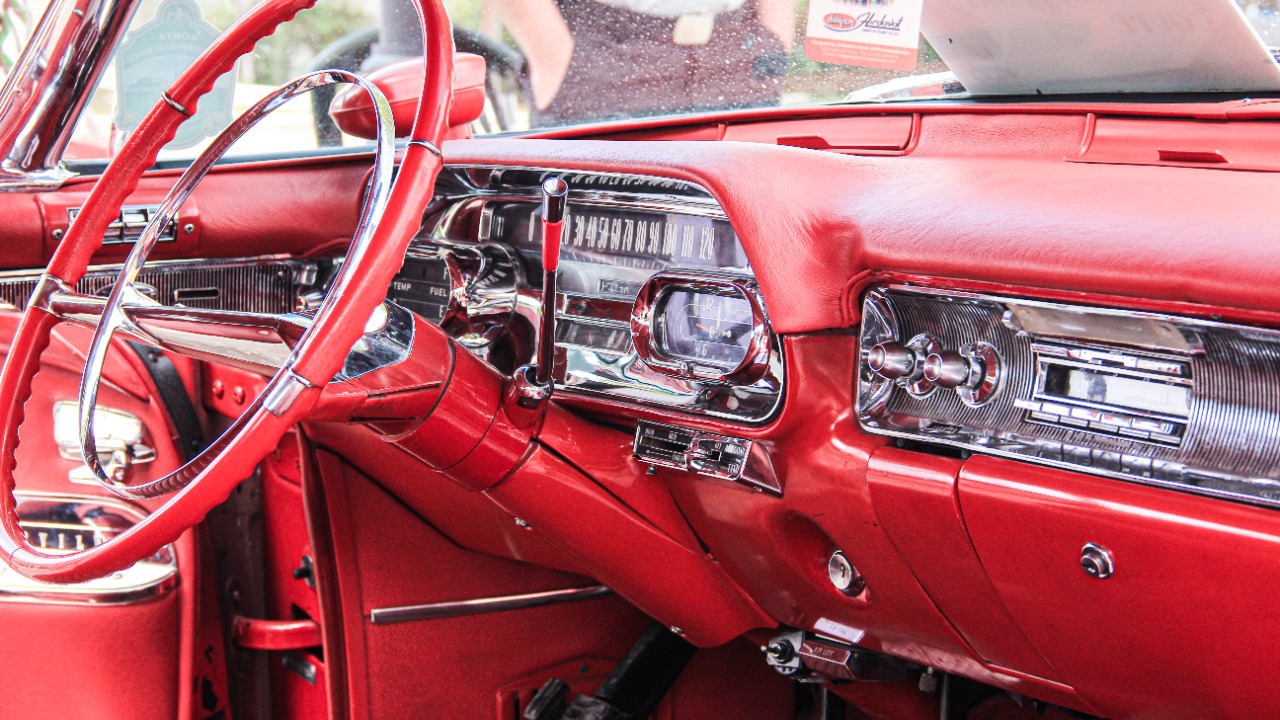
From jet age envy to push‑button overload
In the years after World War II, aviation symbolized cutting edge technology and national pride, and automakers borrowed that aura. Tailfins echoed fighter jets, and instrument panels followed the same script. Instead of a simple speedometer, cars sprouted banks of round dials for oil pressure, engine temperature, battery charge and fuel, often arranged like a pilot’s cluster of flight instruments.
American brands leaned into this theater of complexity. The 1959 Cadillac Eldorado surrounded the driver with chrome‑ringed gauges, a horizontal speedometer and a row of metal toggles that would not have looked out of place in a cockpit. Designers sold the idea that drivers were not just commuting, they were “piloting” precision machines on the open road.
By the 1960s and 1970s, a second force joined the aviation influence. New comfort and convenience features, from air conditioning to multi‑band radios and early cruise control, all demanded physical controls. Each new function arrived as its own knob or switch. Rather than rethinking the layout, most brands simply added more hardware, creating a dense control field that made some production dashboards look like experimental aircraft panels.
There were also genuine safety and regulatory reasons for the clutter. As seat belts, hazard lights and rear window defoggers became mandatory, they required dedicated warning lamps and switches within reach of the driver. Engineers had limited tools to consolidate those signals, so the only option was to carve more real estate out of the dashboard fascia.
Experimenting at the edge of usability
Not every brand followed the same path. Some tried to tame the chaos with radical layouts that now rank among the strangest interiors ever sold. Models such as the Citroën CX and the Aston Martin Lagonda reorganized the cockpit into pods and touch surfaces that looked futuristic but often confused drivers in practice.
The Citroën CX, for example, placed key functions on rotating satellite pods around the steering wheel instead of on stalks. Indicators, lights and wipers lived on these thumb‑operated controls, which allowed the driver to keep hands on the wheel but demanded a steep learning curve. The Aston Martin Lagonda pushed further with a bank of touch‑sensitive buttons and early digital readouts that turned the dashboard into a glowing control wall. These and other experiments, now collected in lists of the weirdest dashboards, showed how far designers were willing to go to stand out.
Japanese manufacturers also joined the push‑button race in the 1980s. Cars like the Subaru XT and some Nissan and Toyota models adopted aircraft‑style binnacles, joystick‑like climate controls and wraparound clusters that cocooned the driver. The idea was to make the cabin feel like a high tech command center. In practice, the sheer variety of shapes and positions often made basic tasks slower until owners built up muscle memory.
Behind the spectacle sat a serious engineering challenge. As electronic systems multiplied, wiring harnesses grew heavier and more complex. Each analog gauge and light needed its own signal path. Without modern multiplexing and software, the only way to show more information was to add more physical components, and that meant more visual noise in front of the driver.
Why the old cockpit mentality feels out of step now
Today’s cars live in a different design climate. Safety research has shifted focus from mechanical failures to human attention, and regulators scrutinize distraction more closely. Studies on glance time and cognitive load have pushed automakers to reduce the number of separate controls, group related functions and simplify instrument clusters.
Digital displays and software have also changed the economics of information. Where a classic dashboard needed a separate gauge for each signal, a modern screen can show speed, navigation, driver assistance status and media on a single surface. Tesla’s early Model S interior, with its large central touchscreen and minimal buttons, signaled how far the pendulum could swing away from the aircraft aesthetic.
The shift is not just about fashion. Carmakers now rely on configurable layouts to support advanced driver assistance systems. When adaptive cruise control or lane keeping engages, the instrument panel can reallocate space to show lane markings, following distance or steering prompts. In a purely analog cockpit, adding those cues would have required still more physical indicators and lights.
There is also a cultural change in how drivers relate to technology. Where mid‑century buyers equated a busy dashboard with sophistication, many current buyers associate simplicity with quality. Luxury brands emphasize clean lines and hidden vents, while software companies have trained users to expect minimal, icon‑based controls. A dashboard that looks like a 747 now risks signaling “old tech” rather than progress.
What the cockpit era still gets right
Yet the airplane‑inspired years left behind some lessons that modern designers are quietly reviving. One is the idea of hierarchy. Classic cockpits placed critical gauges, such as speed and engine health, directly in front of the driver and used size and contrast to signal importance. Secondary functions sat further away or lower on the panel.
Some current digital clusters borrow the same principle. Performance cars from brands like BMW and Porsche still give the tachometer and speedometer prime territory, even when they are rendered on screens. Head‑up displays that project key data into the driver’s line of sight echo the old priority on keeping vital information close to the horizon.
Another lingering insight is tactility. While the old dashboards may have gone too far with knobs and toggles, physical controls let drivers operate common functions without looking away from the road. The recent backlash against all‑touch interiors shows that many users miss this quality. Several manufacturers have already reversed course, reintroducing real buttons for climate and audio after complaints about buried menu systems.
The cockpit era also captured a sense of occasion that some modern cabins struggle to match. Sitting behind a sculpted instrument panel with deep‑set gauges and mechanical switches could make even a short drive feel special. That emotional charge is harder to achieve with flat glass and generic UI elements that can be updated over the air.
How the next generation of dashboards may reconcile both worlds
The future of in‑car interfaces is unlikely to return fully to either extreme. Instead, the next wave of dashboards is starting to blend digital flexibility with a more disciplined version of the old cockpit thinking.
One direction is context aware design. Rather than presenting every option at once, upcoming systems can prioritize a small set of controls based on driving conditions. On a highway, the cluster might highlight navigation and driver assistance status, then shift to parking aids and proximity views at low speed in a city. This approach borrows the classic idea of hierarchy but implements it through software instead of permanent plastic.
Another trend is the move toward “calm” interfaces. Designers talk about reducing nonessential visual motion, limiting color palettes and reserving bright warnings for genuine hazards. In that sense, the airplane metaphor is evolving. Modern aircraft cockpits rely heavily on quiet, stable displays that only erupt in color when something demands immediate attention. Car dashboards are slowly adopting the same philosophy.
More from Fast Lane Only
- Unboxing the WWII Jeep in a Crate
- 15 rare Chevys collectors are quietly buying
- 10 underrated V8s still worth hunting down
- Police notice this before you even roll window down
*Research for this article included AI assistance, with all final content reviewed by human editors