BMW has adjusted one of the most recognizable symbols in motoring, yet the change is so restrained that many drivers will never realize anything has shifted. The company’s roundel, a fixture on bonnets and steering wheels for decades, has been refined rather than reinvented, with subtle tweaks to shape, color, and finish. The result is a logo that looks almost identical at a glance, but has been carefully tuned for a new generation of cars and screens.
The updated badge is already appearing on production vehicles and will soon be fitted across the range, replacing a design that has effectively defined the brand since the late 1990s. For BMW, the quiet rollout reflects a deliberate strategy: modernize the emblem for digital and electric futures without alienating owners who see the roundel as part of the car’s identity.
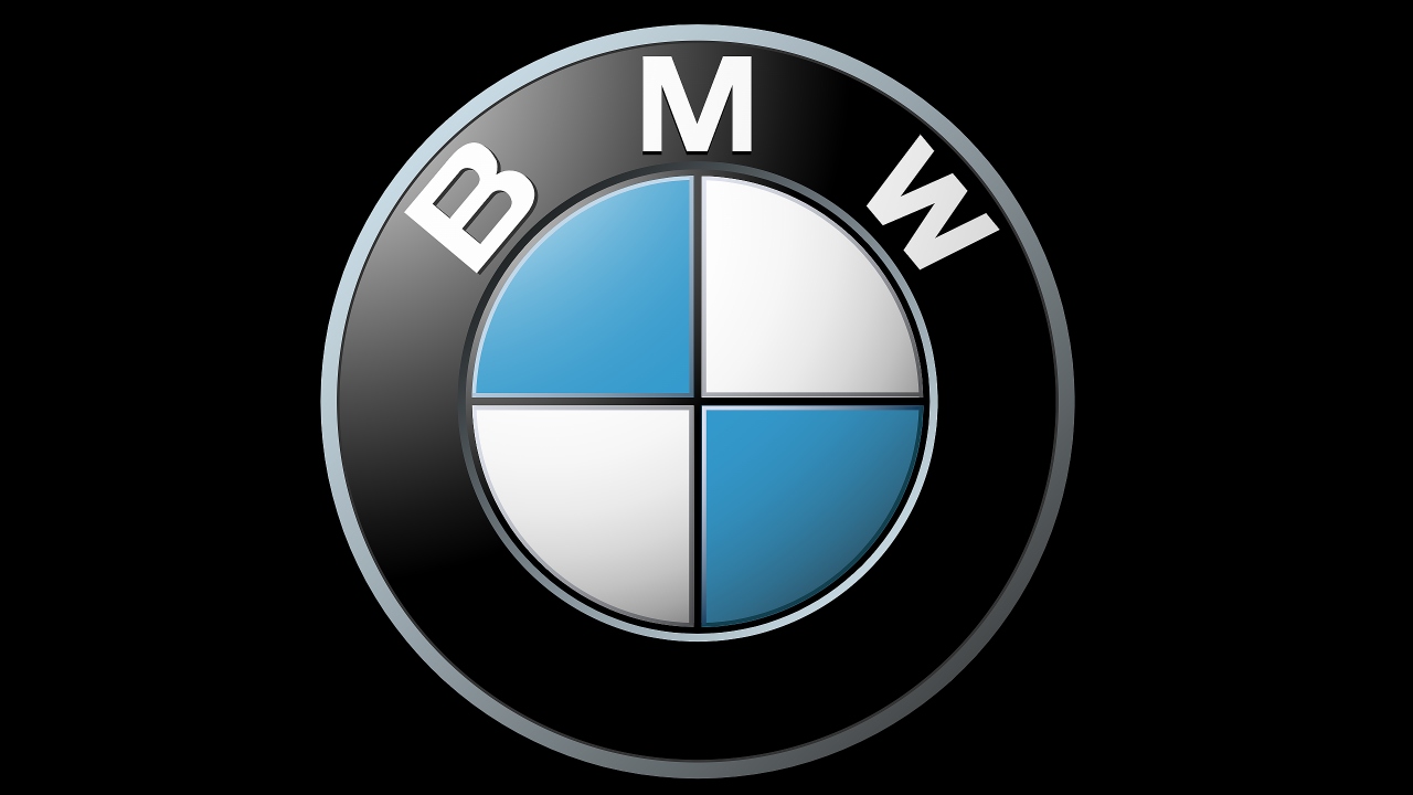
What has actually changed on the BMW roundel
The most important shift is structural rather than conceptual. The familiar black outer ring and blue and white Bavarian quadrants remain, but the detailing that separated them has been simplified. On the previous badge, a distinct inner ring sat between the black circle and the Bavarian flag pattern, creating a layered, three dimensional effect. In the new version that inner chrome ring has been removed, and the outer and inner graphics now read as a single, flatter plane that visually ties the circle and quadrants together.
Design specialists describe how the outer and inner shapes have been streamlined so they appear to run together instead of being divided by a metallic border. The updated emblem also abandons the pronounced three dimensional modeling that characterized the older badge, trading heavy bevels and reflections for a cleaner, more contemporary surface. Reports on the physical badge fitted to the latest iX3 note that the new logo measures 82 mm and is cut more precisely, with slimmer elements that sit closer to the bodywork, reinforcing the impression of a modern, technical object rather than a piece of jewelry.
Color, typography, and the “blink and you miss it” effect
Beyond the geometry, BMW has adjusted color and typography in ways that are almost imperceptible until the old and new badges are placed side by side. The blue and white quadrants now use richer, more saturated hues, which give the Bavarian pattern greater presence without changing its layout. At the same time, the letters “BMW” around the top of the circle have been slimmed and sharpened, with crisper edges and more consistent spacing. The overall effect is of a logo that feels slightly more refined and legible, particularly in close up photography and on high resolution screens.
Observers who examined the first production cars wearing the badge noted that the redesign is intentionally subtle, to the point that many people struggled to identify the differences without direct comparison. Social media posts that challenged viewers to spot the changes “Without Googling” underscored how restrained the update is. The brand has effectively executed a typographic and color refresh that improves clarity and digital performance while preserving the instant recognition that comes from the roundel’s basic silhouette and Bavarian motif.
From concept to production: how the new badge reached the road
The updated roundel did not arrive overnight. BMW first signaled the shift on the Neue Klasse iX3, where the badge appeared with little fanfare. When the new iX3 broke cover, it quietly debuted the revised logo, and the changes were so discreet that most people did not notice until design watchers pointed them out. That early appearance served as a live test of how the emblem would look on a next generation electric SUV, a model that BMW positions as a bridge between its combustion heritage and its battery powered future.
Design focused coverage later highlighted how the new badge’s simplified planes and reduced chrome aligned with the cleaner surfacing of the Neue Klasse concept language. Instead of using a separate inner ring to create depth, the emblem relies on contrast between the black outer circle and the blue and white quadrants, which now sit more flush with the surrounding bodywork. This approach mirrors broader trends in automotive design, where brands are stripping away ornamental chrome and complex textures in favor of minimal, aerodynamically efficient forms that photograph well and translate cleanly into digital interfaces.
Why BMW is rolling it out quietly across the lineup
BMW is not treating this as a dramatic rebrand, and that is deliberate. The company will begin rolling out what it describes as its seventh generation logo across all new cars, with reports indicating that every model leaving the factory from February will carry the updated badge. Internal communications and external commentary frame the move as the first major logo update since 1997, but one that is intentionally evolutionary. By keeping the core roundel intact and focusing on subtle refinements, BMW avoids the backlash that can follow radical logo changes while still signaling progress.
Industry analysis suggests that the quiet rollout also reflects how customers interact with the badge in 2026. The emblem now appears as often on smartphone screens, in-car displays, and digital marketing as it does on metal. A flatter, less chrome heavy design scales more cleanly in app icons and instrument clusters, and it is easier to reproduce consistently across physical and digital environments. Commentators who examined the update noted that the redesign is meant to harmonize the logo’s appearance on everything from the grille of a 3 Series to the splash screen of a connected services app, without drawing attention to itself as a new symbol.
Heritage, electric futures, and what the tweak signals
Although the visual changes are modest, the timing and execution of the update carry symbolic weight. BMW is in the midst of expanding its electric portfolio, and the Neue Klasse iX3 and other upcoming models are intended to define the brand’s next chapter. By refining the roundel rather than replacing it, the company is asserting continuity between its combustion era and its battery powered future. Design commentary around the new badge emphasizes that the blue and white Bavarian quadrants remain central, while the simplified outer ring and flatter finish align with the cleaner, more technical aesthetic of electric vehicles.
Some analysts interpret the removal of the inner chrome ring and the move toward a flatter overall appearance as part of a broader industry shift away from ornate, three dimensional badges. Other manufacturers have already flattened their logos to better suit digital use and to reflect a more sustainable, less ostentatious image. In BMW’s case, the change is framed as a subtle modernization rather than a break with the past, a way to refresh an icon so that it feels at home on a minimalist electric SUV as well as on a traditional sports sedan. For most fans, the emblem on the hood will look exactly as they remember it, which is precisely the point: the logo evolves, but the brand story it tells remains familiar.
More from Fast Lane Only