
In less than a generation, the car dashboard has gone from a cluster of knobs and dials to a wall of glass. What started as a small navigation screen in luxury models has turned into tablet sized displays that now dominate everything from family crossovers to electric hatchbacks. I want to unpack how that happened, why automakers leaned so hard into touch, and why some of them are already quietly backing away.
From knobs and dials to a glass cockpit
The modern screen era in cars did not begin with the current crop of giant tablets, it grew out of early infotainment systems that tried to tame a growing mess of functions. As brands added navigation, complex audio, and vehicle settings, rotary controllers and small displays like BMW’s early iDrive became a way to centralize control instead of scattering more buttons across the dash. Over a few years, that approach turned into an industry template, with a single interface expected to handle an ever increasing list of features inside new models, from drive modes to driver assistance settings, as described in BMW’s own account of how its system quickly became a standard for managing an “ever increasing array of functions” in the cabin.
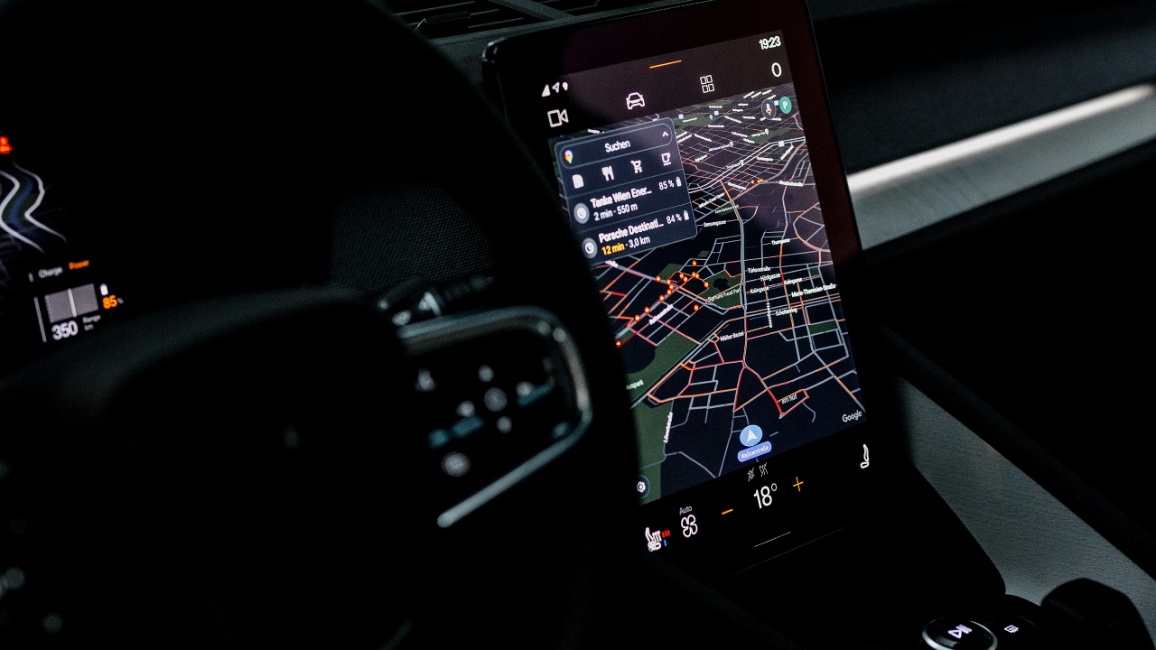
Once that logic took hold, the size and ambition of in car displays grew quickly. Touchscreens that had started as simple panels for radio and climate soon expanded into hubs for navigation, smartphone mirroring, and even gaming, with reports noting how drivers moved from tapping to change the temperature to using the same surface for streaming media and video games like CyberPunk 2077. At the same time, electric focused lineups such as the Volkswagen ID family, along with related models like the Cupra Born and Skoda Enyaq Coupé, adopted large central touch panels as the primary way to interact with the car, a shift that reviewers found both slow to respond and distracting enough to pull eyes off the road for “potentially dangerous lengths of time.”
Why carmakers fell in love with massive touchscreens
Automakers did not scale up screens just because they could, they did it because the economics and marketing lined up. As display technology improved and production volumes climbed, large panels became cheaper per inch, which meant a big screen could replace dozens of individual switches, reduce wiring complexity, and cut the number of dashboard variations needed for different trim levels or for RHD and LHD markets. Commenters dissecting this trend have pointed out that a single configurable interface lets manufacturers standardize hardware and simply toggle features in software, a strategy that also makes it easier to sell subscription based upgrades later. In that light, the giant display is not just a design flourish, it is a cost control and revenue platform.
There was also a powerful halo effect. When Tesla put a large central touchscreen at the heart of its early cars, it signaled that a high tech, minimalist interior was the new definition of premium, and reports on the company’s strategy note that the decision to “throw in a touch screen” was as much about constraining cost as it was about setting a new standard. Other brands quickly followed, chasing the same perception that a clean dashboard dominated by glass looked more luxurious and up to date, a point enthusiasts now summarize bluntly as “Luxury perception, thank you Tesla,” when they talk about how a high tech environment became shorthand for modernity and simplicity across entire lineups.
Design freedom, software ambition, and the trickle down effect
Once big displays were accepted as a luxury cue, they started to reshape the physical dashboard itself. Designers no longer had to carve out space for rows of buttons or traditional gauge clusters, so they could stretch screens across the cockpit, float them above minimalist consoles, or merge instrument panels with infotainment into a single sweeping surface. Industry analysis describes a “Trickle Down Effect and Change in Dashboard Design,” where flagship models with dramatic glass heavy interiors set expectations that then filtered into more affordable cars, helped along by the fact that there were simply “more display applications” to justify the real estate, from camera feeds to detailed energy use graphs.
That trickle down has been especially visible in electric and tech forward vehicles. Concept like interiors with continuous panels have made their way into production, and manufacturers are already planning for a future where screens are “spread around the vehicle’s interior,” not just in the center stack but in door panels, passenger zones, and rear entertainment, according to projections that imagine cabins filled with flexible displays echoing the futuristic shapes of the 1950s, 60s, and 70s. Even mainstream brands such as Volkswagen now showcase large, tablet like interfaces across their online configurators, signaling that a screen centric cockpit is no longer reserved for luxury badges.
The safety and usability backlash
As screens grew, so did the list of complaints from drivers and safety experts who actually had to live with them. Touch surfaces that looked clean in photos often proved frustrating in traffic, forcing drivers to dig through menus for basic tasks like changing the cabin temperature or adjusting the fan speed. Safety advocates have warned that this kind of “screen fatigue” leaves carmakers at a crossroads, with some, like Ford and Mercedes-Benz, pushing ahead with expansive displays while others quietly admit that the all touch approach is “not resonating with today’s buyers” who want critical functions on physical controls. The concern is not aesthetic, it is about how long eyes are off the road when a driver has to hunt through layers of icons instead of grabbing a familiar knob.
Real world tests have underlined those fears. Reviews of electric models such as the Volkswagen ID series, the Cupra Born and Skoda Enyaq Coupé describe central touch systems that respond slowly and bury simple adjustments in submenus, forcing drivers to look away for “potentially dangerous lengths of time” just to tweak the climate or audio. Enthusiasts on forums have been even more blunt, arguing that touchscreens are “making cars worse” and calling for a return to tactile controls, while others concede that a digital cluster is “the best and most acceptable way to include screens” because it replaces gauges without taking over every interaction. The pattern is clear: drivers are not rejecting screens entirely, they are pushing back against designs that prioritize visual drama over intuitive, eyes free operation.
Buttons strike back, but the glass era is not over
Faced with that backlash, some carmakers are already reversing course on their most aggressive touch only interiors. Volkswagen, which had leaned heavily on capacitive sliders and screen based menus, is now making what one report calls the “sensible decision” to bring physical buttons back across its range after years of rolling out models with touchscreen operated controls. Other brands are following a similar path, with coverage of industry trends noting that Carmakers are restoring dedicated knobs and switches for climate and audio in response to customer complaints and safety concerns, and that some newer systems, like Mazda’s, limit what you can tap depending on the app and whether the car is moving, effectively forcing drivers to use safer, simpler inputs on the move.
At the same time, analysts who track interior tech caution that the age of the giant display is not about to vanish. Even as some manufacturers rediscover the value of tactile controls, others are planning cabins with even more screens, betting that passengers will expect to stream, work, and play on the move. Reports on future concepts describe vehicles that host “screens galore,” with displays embedded in more surfaces and serving more roles, from augmented navigation to personalized ambient themes. Features coverage on interior trends suggests that while there is a growing “call for physical controls,” especially for core driving tasks, the broader direction still points toward a hybrid cockpit where large touch panels coexist with carefully chosen buttons, voice commands, and perhaps gesture controls, rather than a full scale retreat to the analog dashboards of the past.