Kia’s latest cabins are no longer content with safe blacks and beiges. From the 2027 Telluride’s unexpected interior palettes to concept cars that look dipped in gelato, the brand is leaning hard into color as a design signature. Behind those choices is a deliberate strategy from Kia’s design leadership, which sees bold interiors as a way to signal a new identity and keep pace with a rapidly changing car market.
Rather than chasing novelty for its own sake, Kia is using unusual hues to express a broader philosophy about contrast, technology, and emotion in the car. The company’s design boss has framed these interiors as a natural extension of Kia’s global design language, one that treats the cabin as a living space where color can guide mood, highlight technology, and differentiate models that share similar hardware.
From beige boxes to statement spaces
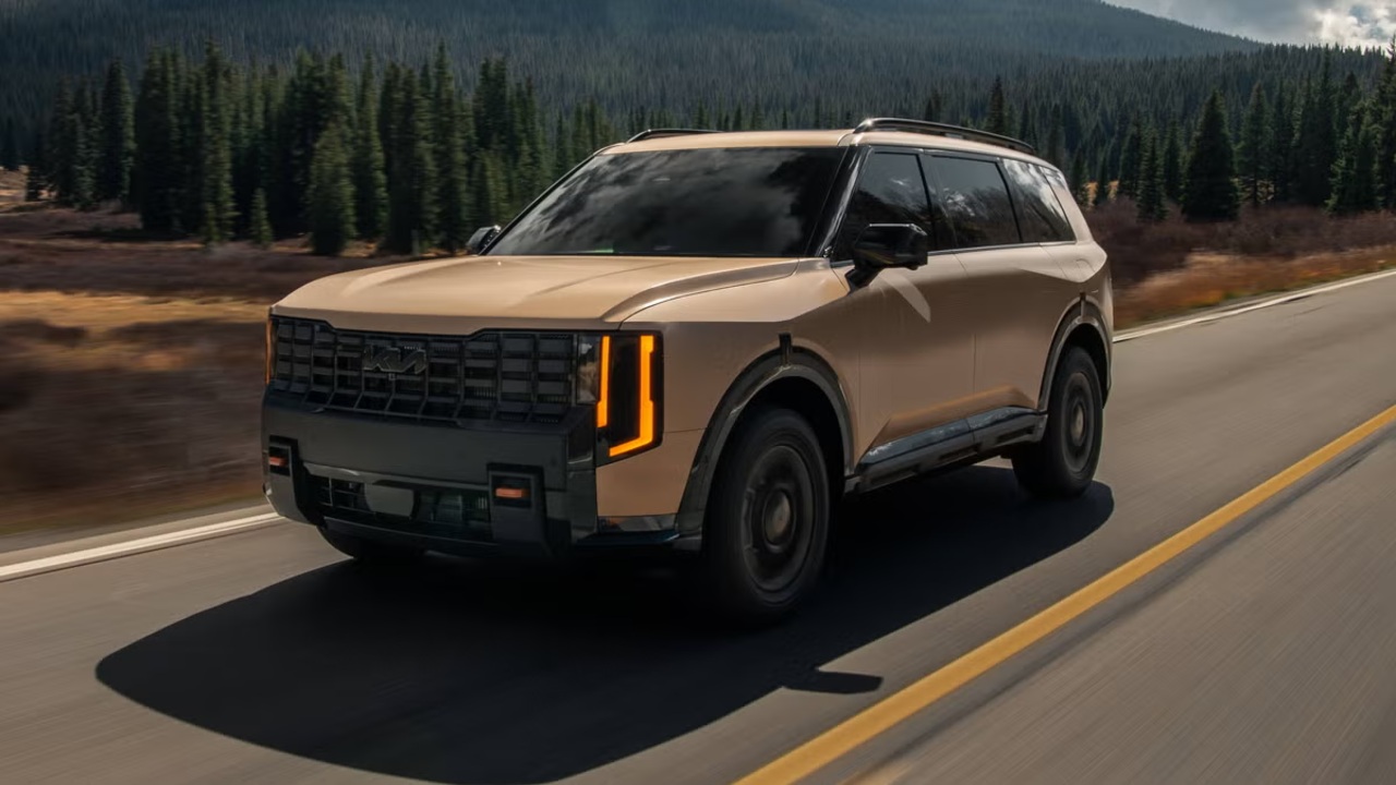
The shift in Kia’s interiors starts with a simple observation: the traditional hierarchy of car design has flipped. For decades, exterior styling carried the emotional weight while cabins were expected to be neutral, durable, and largely invisible. Kia’s design chief has argued that this balance no longer works in a world where drivers spend more time interacting with screens, ambient lighting, and materials than with sheet metal, and where many crossovers share similar silhouettes regardless of badge. In that context, the decision to give the 2027 Telluride a set of distinctive interior color combinations is less a stunt and more a recognition that the cabin is now the primary stage for brand character, especially in family SUVs that live their lives in school queues and parking garages rather than on mountain passes.
That thinking is visible in the way Kia talks about its design philosophy. On its global brand site, the company describes a framework called OPPOSITES UNITED, which explicitly embraces contrast to create “characterful designs.” Color is one of the most immediate tools for that contrast, especially inside the car where light, texture, and hue can be orchestrated together. Instead of treating the interior as a monochrome backdrop, Kia is using it as a canvas for this philosophy, pairing calm surfaces and horizontal lines with unexpected tones that keep the space from feeling anonymous.
Why the 2027 Telluride looks like this
The 2027 Telluride is the clearest production example of Kia’s new interior attitude. According to the company’s design boss, the SUV’s unusual cabin palettes were chosen to push the model beyond the safe, dark interiors that have dominated the segment. The idea was to give buyers a sense that they were stepping into a curated environment rather than a generic family hauler, even if the underlying package of three rows and a boxy profile remains familiar. That is why the Telluride’s interior options lean into distinctive color blocking and richer tones that would have been considered risky only a few product cycles ago, especially in a mainstream model.
Reporting on the Telluride’s update notes that Kia’s leadership sees these choices as a way to keep the SUV feeling fresh without resorting to heavy-handed exterior changes, which can be expensive and polarizing. By contrast, interior color and trim can be adjusted more nimbly while still delivering a strong emotional impact. The design chief has framed the Telluride’s cabin as a proof point that customers are ready for more adventurous combinations, provided the overall layout remains intuitive and the materials feel appropriately upscale, a balance that aligns with the broader strategy of using color to signal progress without alienating existing owners.
OPPOSITES UNITED, translated into color
Kia’s official design manifesto, presented under the banner of OPPOSITES UNITED, is not just a slogan for concept cars. It lays out five pillars that revolve around tension and harmony, and color is central to how those ideas reach the showroom. The philosophy talks about adapting to a changing world and using contrast to create distinctive forms, which in practice means pairing soft, almost domestic interior shapes with sharper, more technical elements. Color helps mediate that relationship: warm, earthy tones can soften the presence of large digital displays, while cooler, more saturated hues can emphasize the precision of switchgear and lighting.
In interviews about the brand’s direction, Kia’s design chief has emphasized horizontality and a sense of athletic elegance inside the cabin, describing an effort to make interiors feel lean, sleek, and dynamic rather than bulky. That approach is visible in recent dashboards that stretch in clean lines from door to door, with vents and screens integrated into a single visual band. Once that architecture is set, color becomes the variable that can shift the mood from relaxed to sporty or from minimalist to expressive. The company’s own design materials make clear that this is intentional, presenting interiors where contrasting tones highlight structural lines and create a sense of layered depth rather than a single flat color field.
Cabins as living rooms, not cockpits
Another reason Kia is leaning into unconventional interior colors is the changing role of the car itself. As more models adopt advanced driver assistance and increasingly digital interfaces, the cabin is evolving from a traditional cockpit into something closer to a rolling living room. Kia’s design leadership has acknowledged this shift, noting that the brand aims to make interiors feel both dynamic and comfortable, with a strong emphasis on horizontal layouts that visually widen the space. In that context, color is not just decoration but a tool to define zones, guide the eye, and make long periods in traffic or on the highway feel less fatiguing.
The 2027 Telluride’s interior, for example, uses its bolder hues to break up what could otherwise be a vast expanse of plastic and leather across three rows. By introducing contrasting tones on the dash, doors, and seats, the design team can subtly signal where passengers are meant to focus and where technology lives, without relying solely on bright screens or aggressive lighting. This approach aligns with comments from Kia’s design chief in a recent discussion, where he described the goal of making cabins feel elegant and athletic at the same time, a balance that depends as much on color and proportion as on any single feature.
Risk, reward, and the future of Kia’s interiors
There is, of course, a risk in moving away from conservative interior palettes, particularly for a brand that sells in high volumes to buyers who may prioritize resale value and familiarity. Kia’s design boss has effectively argued that the greater risk lies in blending into the background at a time when competitors are also investing heavily in design. By using color as a differentiator, Kia can give even its mainstream models a sense of individuality that might previously have been reserved for limited editions or luxury trims. The 2027 Telluride’s unusual cabin options are an early test of how far that strategy can stretch in a family vehicle that must appeal to a wide audience.
Looking ahead, the logic behind these choices suggests that Kia will continue to treat interior color as a strategic lever rather than a last-minute styling decision. The OPPOSITES UNITED framework gives the brand a rationale for pairing calm, minimalist forms with more expressive hues, while the focus on horizontal, athletic interiors provides a stable canvas for experimentation. If customers respond positively to the Telluride and other models that adopt similarly distinctive cabins, Kia’s “weird” colors may quickly feel less like an oddity and more like a new normal, a sign that the brand has embraced the interior as the clearest expression of its evolving identity.
More from Fast Lane Only