Ferrari has managed to turn a routine kit reveal into the first flashpoint of the 2026 Formula 1 season. The team’s new race suit has been greeted with near-unanimous praise for its bold look, yet a single, stubborn detail has ignited a backlash among the most devoted supporters. What should have been a straightforward celebration of tradition and star power has instead become a case study in how one color patch can dominate the conversation around an entire design.
At the heart of the debate is a tension that has long defined Ferrari in Formula 1: the balance between commercial reality and the mythology of the Scuderia’s red identity. The 2026 suit leans into that heritage more aggressively than in recent years, but the placement and color of a key sponsor element have left many fans feeling that the team has compromised the purity of its image at the very moment it sought to reinforce it.
The new suit: classic red, sharpened for 2026
The 2026 race suit is, at first glance, exactly what Ferrari loyalists have been asking for. The design keeps the traditional red base that has defined The Scuderia Ferrari for generations, while introducing heavier white accenting that frames the torso and shoulders in a cleaner, more geometric way. Compared with the more fragmented patterns of recent seasons, the new layout appears more deliberate, with the red allowed to dominate and the white used to sharpen lines rather than distract from them.
Ferrari has also used the new suit to recalibrate how its branding sits on the drivers’ bodies. Sponsor logos are positioned higher on the chest, creating a more structured visual hierarchy that places the prancing horse emblem in a prominent, almost heraldic opposition to the title sponsor. The effect is to turn the upper torso into a focal point where identity and commerce meet, a choice that becomes crucial to understanding why one small detail has provoked such a strong reaction among fans who otherwise approve of the overall look.
Leclerc, Hamilton and the symbolism of the reveal
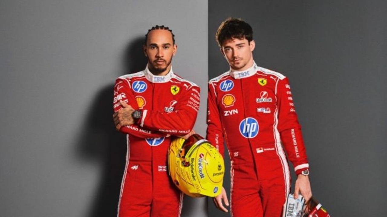
The decision to unveil the suit with Leclerc and Hamilton modeling it was not a mere formality, it was a statement about the era Ferrari intends to define with this design. Leclerc and Hamilton, presented together in the new race gear, embody both continuity and disruption: one is the long-term Ferrari standard-bearer, the other a multiple world champion arriving with the expectation of instant success. By placing both drivers in matching 2026 suits, Ferrari signaled that this visual identity is meant to be the shared uniform of a renewed title push rather than a transitional experiment.
The race gear itself reinforces that message through its details. The Scuderia Ferrari outfit has kept the red more dominant than it has in recent years, a clear nod to supporters who had grown wary of creeping black and other secondary colors. At the same time, the more assertive white accents and the elevated sponsor placements give the suit a modern, almost minimalist edge that aligns with Hamilton’s global brand and Leclerc’s status as a leading figure of the current generation. The reveal therefore framed the suit as a bridge between Ferrari’s past and its ambitions for 2026, which only heightens the frustration among fans who feel that one element undermines that carefully crafted balance.
The tiny blue flash that set fans off
The controversy centers on a detail that, in pure surface area, is almost negligible: the blue of the title sponsor, Hewlett, which sits opposite the prancing horse on the chest. On the suit, that blue patch is small, but it is placed at the very heart of the design, directly in the viewer’s line of sight. For many Ferrari supporters, the presence of blue in such a privileged position clashes with the team’s red-and-white identity, especially when the rest of the suit has been so carefully tuned to emphasize tradition.
What has particularly inflamed opinion is the perception that the blue of Hewlett is not confined to the race gear. Reporting around the launch notes that the title sponsor’s branding remains blue on the car as well, reinforcing the sense that this is not a subtle accent but a recurring visual interruption in Ferrari’s palette. Fans who had welcomed the stronger red base and the more disciplined white accents now see the blue chest block as a jarring intrusion, a single square of color that draws the eye away from the prancing horse and, in their view, dilutes the purity of the Scuderia’s image.
Why sponsor placement matters so much in Maranello
For most teams, a sponsor logo is simply part of the commercial fabric of Formula 1, but at Ferrari, color and placement carry a weight that borders on the sacred. The decision to move sponsor logos higher on the chest has practical logic, it improves visibility in broadcast shots and photography, and it aligns with modern design trends that favor clean, concentrated branding zones. Yet by placing Hewlett’s blue opposite the prancing horse at this elevated height, Ferrari has effectively given the sponsor equal billing with its own emblem in the most visible part of the suit.
That visual parity is what many fans find difficult to accept. The prancing horse has long been the unchallenged centerpiece of Ferrari’s racing identity, and the new layout, while aesthetically coherent, asks supporters to accept a corporate blue rectangle as its counterpart. The fact that the rest of the suit leans so heavily into red and white only sharpens the contrast, making the blue appear less like a considered accent and more like an unavoidable concession. In a community where debates over stripe thickness and shade variations can run for days, the symbolism of that placement was always likely to be magnified.
Fan culture, aesthetics and the limits of compromise
The reaction to the 2026 suit underlines how deeply Ferrari’s supporters invest in visual continuity as a proxy for competitive and cultural stability. Many fans have praised the broader direction of the design, noting that the red base feels more assertive and that the white accenting is more harmonious than in some recent seasons. Yet the anger over the blue detail shows that, for a significant portion of the fanbase, there is a threshold beyond which commercial branding cannot intrude without triggering a sense of betrayal, even when the rest of the package appears to honor tradition.
Ferrari now finds itself in a familiar position, trying to reconcile the financial realities of modern Formula 1 with the expectations of a global community that views the team as a custodian of racing heritage rather than just another brand platform. The 2026 suit demonstrates how narrow that margin for error has become. A design that, in almost every respect, delivers what supporters had requested is being overshadowed by a single, strategically placed patch of blue. In the months ahead, as Leclerc and Hamilton take to the grid in this uniform, the question will be whether on-track performance can persuade fans to accept that compromise, or whether that tiny detail will remain a symbol of a broader unease about how far even Ferrari must bend to the demands of sponsorship.
More from Fast Lane Only