When Oracle Red Bull Racing pulled the covers off the RB22 at Ford’s headquarters in Michigan, the most striking thing was how familiar it looked. For all the talk of a new Ford partnership and a fresh 2026 rulebook, the car that will carry the team into Formula 1’s next era still reads instantly as classic Red Bull, from its deep blue base to the aggressive flashes of yellow and red. The team has chosen evolution over reinvention, using a throwback visual language to signal continuity at a moment of major technical change.
That decision is not accidental. In a season when Red Bull and Ford are beginning a new engine alliance and the sport is pivoting to lighter, more efficient “nimble” cars, the livery is being asked to do a lot of work: reassure fans, satisfy a powerful new partner, and connect the RB22 to the team’s early years in the mid‑2000s. The result is a design that nods to the past while sitting on a chassis that is radically different beneath the paint.
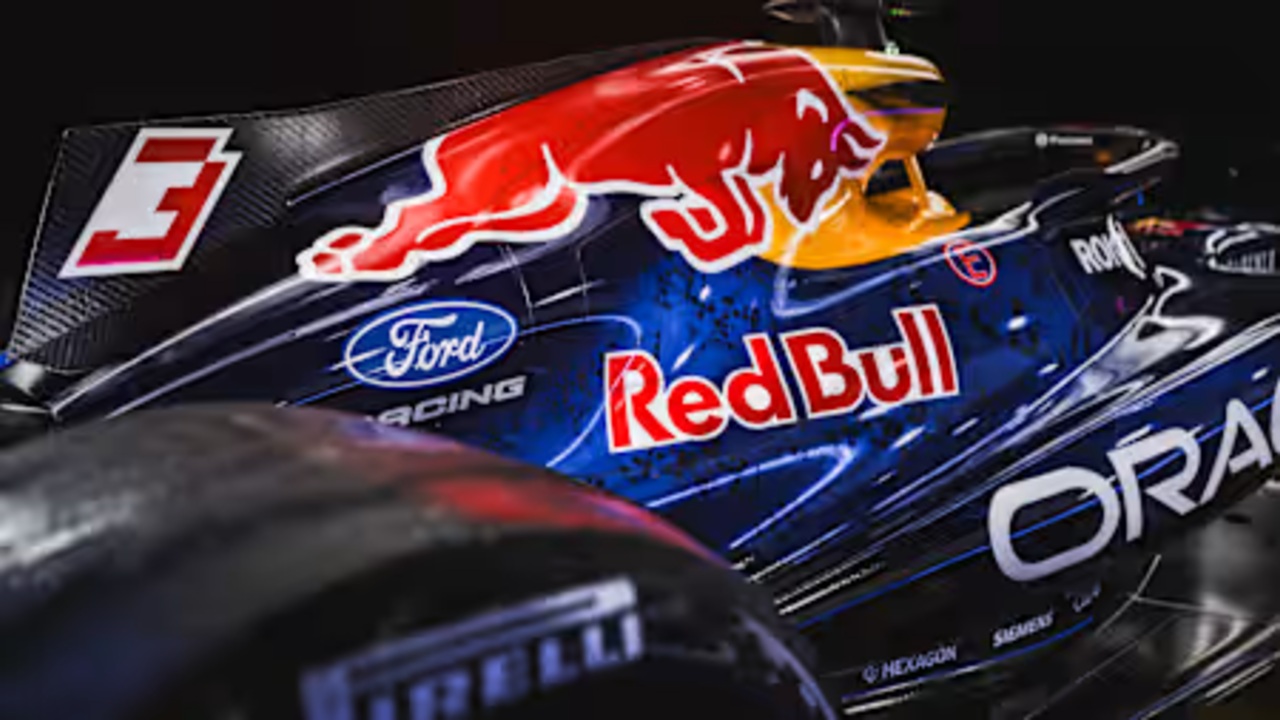
Ford power, familiar paint
I see the RB22 as a visual bridge between eras, a car that has to look new enough to mark the start of the Ford partnership yet familiar enough that supporters recognise it in an instant. Oracle Red Bull Racing is building the next generation of Formula 1 engines in partnership with Ford, a project that will define the team’s competitiveness under the 2026 regulations. Yet when the car was revealed at Ford’s Michigan base, the livery leaned heavily on the deep navy, bold yellow nose and charging bull iconography that have become synonymous with Red Bull’s dominance.
That choice reflects a clear hierarchy of priorities. The technical package, including the Ford‑branded power unit, is where the revolution is happening, while the surface is tasked with projecting stability. Team figures have framed the design as a celebration of the spirit with which Red Bull first entered the sport, and the visual echoes of those early cars are deliberate. Even as the Ford logos take up prominent real estate on the bodywork, the overall impression is that Ford has been invited into Red Bull’s world, not the other way around.
A throwback that stops short of nostalgia
Calling the RB22 livery a throwback is accurate, but it risks understating how carefully calibrated the design really is. The Red Bull look for 2026 is not a dramatic departure from what the cars wore in 2025, yet there are meaningful tweaks that reflect the new partnership and the commercial realities of a team that has grown into a global powerhouse. The base colour remains that familiar dark blue, but the detailing has been sharpened, with cleaner lines and more disciplined use of the red and yellow accents that frame the charging bull motif.
What interests me is how the team has resisted the temptation to chase a full retro scheme, even as it talks about honouring its early years. The livery is described as being designed to celebrate the spirit with which Red Bull entered Formula 1, not to recreate a specific past car. That distinction matters. It allows the designers to borrow cues from the mid‑2000s, such as the bold nose treatment and the way the bull graphic dominates the sidepod, while still accommodating modern sponsor placements and the prominent Ford branding that now sits alongside the Oracle Red Bull Racing identity.
New regulations, old identity
Underneath the paint, the RB22 is a very different machine from its predecessor, and that contrast only heightens the sense of visual continuity. The car is smaller, 30 kg lighter and narrower than before, changes driven by the 2026 “nimble car” regulations that aim to make Formula 1 machinery more agile and efficient. Aerodynamic devices that can toggle between high‑downforce and low‑drag modes are part of this new philosophy, and the RB22’s sculpted bodywork reflects that shift even if the colour palette does not.
From my perspective, this is where the livery’s conservatism becomes a strategic asset. With so much changing in the underlying architecture, from chassis dimensions to the hybrid power unit that Red Bull is developing with Ford, the team has chosen to keep its visual identity as a constant. The familiar dark blue and charging bull help mask the fact that the car’s proportions have been tightened and its surfaces reworked to meet the new rules. It is a reminder that in Formula 1, continuity of brand can be as important as innovation in hardware when it comes to reassuring fans and partners that a team remains itself through upheaval.
Two teams, one visual language
The 2026 launch in Detroit did not just belong to the works outfit. Red Bull and Racing Bulls unveiled their new liveries side by side with Ford, underscoring how the company now operates a two‑team ecosystem with a shared technical and commercial spine. Racing Bulls, the junior squad that has evolved from Red Bull’s long‑running second team, presented a look that clearly sits in the same family as the RB22 while retaining its own identity. The colour blocking, sponsor hierarchy and bull imagery all echo the senior car, even as the exact shades and placements differ.
That alignment is not merely aesthetic. Racing Bulls is where drivers such as Lawson, who was moved from Red Bull to the junior team at the start of 2025 and then finished the season strongly, are expected to prove themselves. By giving both cars a related visual language, Red Bull reinforces the idea of a coherent ladder system, with young talent graduating from Racing Bulls to Oracle Red Bull Racing without losing the sense of belonging to the same brand universe. The shared presence of Ford branding across both liveries further underlines that the engine partnership is a group‑wide project rather than a single‑team experiment.
Heritage, marketing and the limits of change
What ultimately stands out to me is how carefully Red Bull has balanced heritage and marketing in this first Ford‑era design. The team has spoken of celebrating the spirit with which it entered Formula 1, and the RB22’s livery does that by leaning into the colours and shapes that defined its rise from upstart to serial champion. At the same time, the car is a rolling billboard for a new power unit programme with Ford, and the placement of that branding, alongside long‑standing partners such as Oracle, reflects a complex negotiation of space and symbolism on a much smaller, lighter chassis.
There were other paths Red Bull could have taken. A radical colour shift to foreground Ford, or a full retro scheme that mimicked a specific early‑2000s car, would have generated headlines but risked diluting the core identity that has been built over two decades. Instead, the team has opted for a more restrained evolution, one that allows the technical story to carry the sense of novelty while the livery quietly reassures viewers that this is still the same Red Bull they have been watching for years. In a sport where perception can be as influential as lap time, that restraint may prove as valuable as any aerodynamic upgrade.
More from Fast Lane Only